Get 5% off your first invitation! Valid for limited time!
Best Font for Wedding Invitations in Microsoft Word
Introduction
When planning a wedding, invitations are often the first thing your guests will see. They set the tone for the big day and reflect your unique style as a couple. Choosing the right font in Microsoft Word may seem simple, but it can completely transform how your invitation looks and feels. From romantic scripts to modern minimalist styles, the font you pick becomes a subtle storyteller of your wedding theme.
Why Fonts Matter in Wedding Invitations -
First Impressions for Guests
Your invitation is like a sneak peek into your wedding. The font instantly communicates whether the event is formal, casual, rustic, or glamorous.
Setting the Wedding Theme
Fonts work like a visual cue—script fonts suggest elegance, serif fonts feel timeless, and sans-serif fonts bring modern charm.
Creating a Consistent Look
When your invitations, menus, programs, and signage all use matching fonts, everything feels cohesive and beautifully tied together.
Key Features of a Perfect Wedding Font -
Elegance and Style
A wedding font should carry charm, romance, or sophistication to match the event.
Readability
Even the prettiest font loses value if your guests can’t read the details. Balance style with clarity.
Versatility for Printing and Digital
Your font should look stunning both on-screen (for digital invites) and on paper (for print invitations).
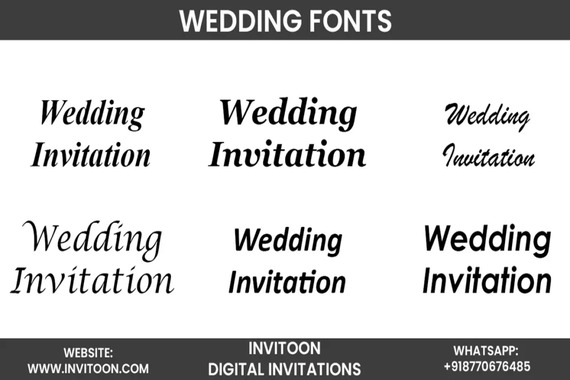
Best Script Fonts in Microsoft Word for Wedding Invitations -
Edwardian Script ITC
This flowing font is graceful and elegant—perfect for formal weddings.
Lucida Calligraphy
A romantic choice that combines style with readability.
Kunstler Script
Delicate and artistic, it’s ideal for couples who love a touch of old-world charm.
Palace Script MT
Sophisticated and regal, this script font shines on formal invitations.
Classic Serif Fonts in Microsoft Word -
Times New Roman (Elegant Simplicity)
Often overlooked, but when used in wedding invites, it provides a clean, timeless feel.
Baskerville (Timeless Charm)
This refined font makes any text look elegant and dignified.
Garamond (Classic and Refined)
A favorite for many designers, Garamond’s balance of readability and sophistication makes it perfect for body text on invitations.
Modern and Minimalist Fonts in Microsoft Word -
Calibri (Clean and Modern)
A go-to modern font that looks neat and easy to read on digital and print invitations.
Century Gothic (Chic and Contemporary)
With its geometric design, this font brings a stylish, modern vibe.
Segoe Script (Stylish yet Readable)
Casual yet romantic, it works beautifully for couples who want something fun but elegant.
How to Combine Fonts for Invitations -
Pairing Scripts with Serifs
For example, use Edwardian Script for names and Garamond for event details.
Mixing Modern with Classic
Pair a clean sans-serif like Century Gothic with a calligraphy font for balance.
Avoiding Overcrowded Designs
Stick to two, at most three, fonts to keep your design neat and appealing.
Font Sizes and Formatting Tips in Word -
Best Font Sizes for Invitations
Names: 18–24pt
Details: 12–14pt
Subtext: 10–12pt
Using Bold and Italics Wisely
Highlight important parts like names or venues, but don’t overuse them.
Adding Decorative Elements
Word allows borders, shapes, and even flourishes to complement your font.
Color and Font Pairing Ideas -
Classic Black and White
Timeless and sophisticated, this combination never fails.
Gold and Script Fonts
Gold foil or gold ink paired with scripts adds luxury.
Pastels for Romantic Themes
Soft pinks, blues, or lavender pair beautifully with serif or handwritten fonts.
Tips for Printing Invitations in Word -
Paper Quality Matters
A high-quality cardstock enhances the look of any font.
Print Preview Before Finalizing
Always check alignment, spacing, and sizing before printing.
Test on a Sample Page
Print one invitation first to make sure everything looks perfect.
Common Mistakes to Avoid -
Using Too Many Fonts
Keep it simple with no more than three fonts.
Overly Decorative Styles
If a font looks beautiful but is hard to read, it won’t work.
Ignoring Readability
Remember: guests need to read all details at a glance.
Conclusion
Your wedding invitation deserves fonts that mirror your love story and style. With Microsoft Word’s wide selection, you can find elegant scripts, timeless serifs, and modern sans-serifs that match your theme. Whether you’re planning a black-tie affair or a casual outdoor wedding, the right font transforms your invitation from ordinary to unforgettable.
FAQs
Q1: How do I get the best wedding digital invitation?
At Invitoon.com, find stunning digital invitations with perfect fonts—from classic elegance to modern charm—customized to make your big day truly unforgettable.
Q2: Can I use multiple fonts on one invitation?
A: Yes, but stick to two or three fonts for balance and readability.
Q3: Which Word font is best for modern weddings?
A: Century Gothic and Calibri work well for minimalist, modern invitations.
Q4: Do fonts look different when printed?
A: Yes, always test print your invitation to check how the font looks on paper.
Q5: Can I download new fonts into Microsoft Word for my wedding invites?
A: Absolutely. You can install fonts from external sources and use them directly in Word.
Connect
Explore our customizable digital invitations today!
invitoon.store@gmail.com
+91 9243781585
© 2025. All rights reserved. Invitoon